The point of this project was abstraction. For this project, I was to paint three different interpretations of a picture, with each one being an abstraction of the other. For instance, I painted a first picture of an image, and then abstracted that image in a second painting. Then, I made a third painting, which was to be an abstraction of the second painting. The painting I chose to do was a picture that I had taken of a boardwalk descending to a beach, running through bushes. There is the ocean in the distance, and the clear blue sky above it. For the first painting, I basically painted the image as it appeared in the photo, but I left out some of the details. For instance, some of the details of the clouds and sky were left out of the painting, as well as for the boards. For the second painting, I made an abstract version of the first painting, but focused less on the details of the project, and the individual shapes of the object, and more on making each and every object stand out. I turned all of the shapes into either squares and rectangles, with exception of the bushes, so that every object had four corners and straight lines. However, I think that the second painting was not as good as the first one because of how realistic it looks. For the third painting, I abstracted the second painting. The main difference between the second and third painting was that the third painting is much brighter and “cleaned up” than the second one. Also, the bushes feature a different design. The colors are much brighter in the third painting than in the second painting. In conclusion, I think that abstraction is neat, but is not particularly my style of painting. I am more realistic and I like to have a set objective and a set way to achieve that objective instead of having multiple ways to get there. Its very confusing and I don’t like to think of myself as a very creative person. I think that my art could have been neater in the first two paintings as I was in the third. I like the finished product because at first, I wasn’t sure what I would do for this project and very confused at the idea of abstraction for the first time, but I figured out how to do it and went to work from there. I think this was a successful project because it served as an introduction to abstract art in a simple way.
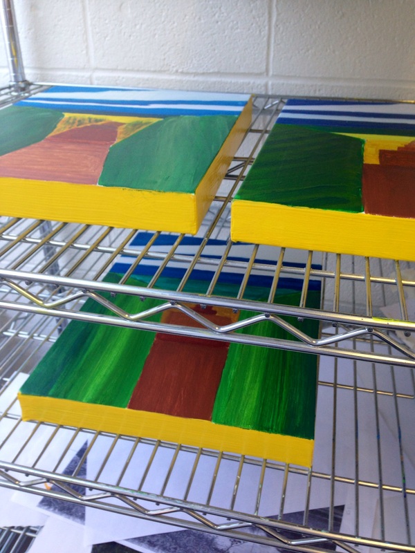
Since the three paintings have already been completed, all I did for this one was add another coat of yellow around the outside of the canvases. I think that the bright yellow brings out the other individual colors present in the paintings. Overall, I think this painting was a success because of how i learned to paint abstract paintings. I was unsure at first, but now i kind of figured it out and I think it went well.
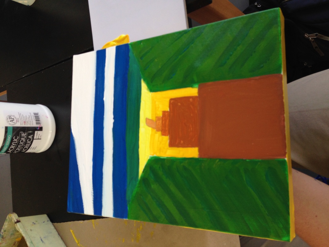
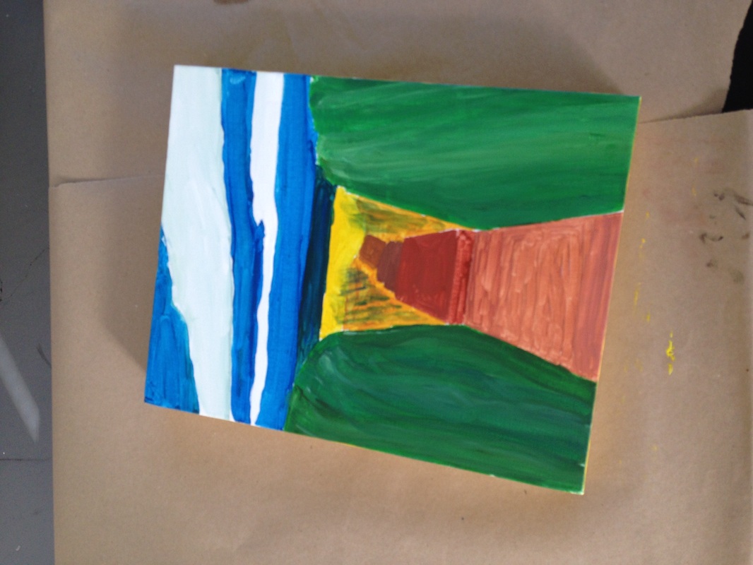
This painting shows the completion of the third and final painting, and abstract of the other abstract painting. It displays brighter and more vibrant colors than the first two paintings, and features a back-and-forth diagonal design on the bushes. The sky is a brighter blue, and the sand and boards are brighter shades of gold and brown, respectively. This painting does look a lot cleaner than the other
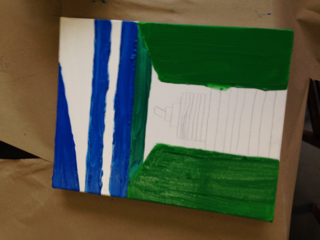
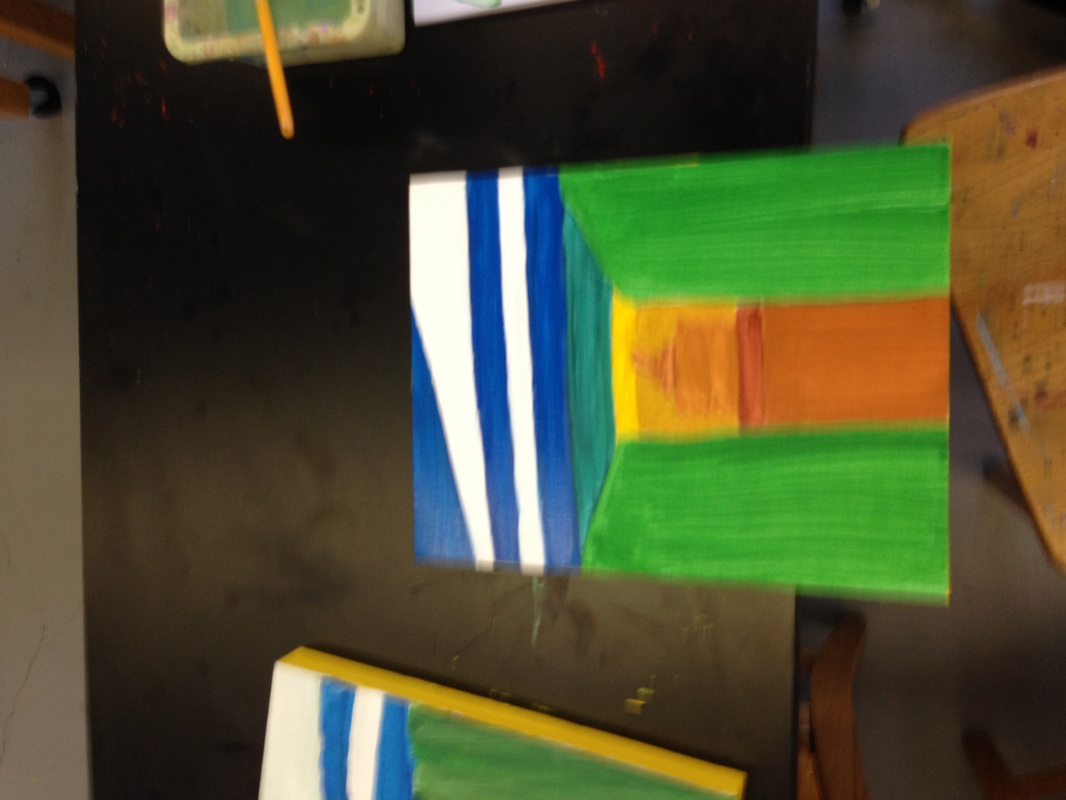
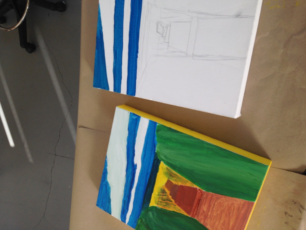
This image shows the beginnings of the third abstract painting, which has sort of the same qualities as the third ones, but just has brighter colors in the sky and bushes. So far the sky is a bland dark-blue color, and so far the bushes are just plain green. The colors are going to be added into the next painting. This also shows the design for the boardwalk and the different shapes that it contains. I think that this painting will turn out better than the first.
This picture shows the completion of the second painting, which was just an abstraction of the first one. I decided to make everything linear and defined as a rectangular shape. The colors do not blend together as much as they did in the first painting, with exception of the bushes, so they are clearly defined objects and shapes. Every single element of this painting is clearly defined, and easily distinguishable from the others. I like this second painting because it has a different quality in the shapes to it than the first one does, but it is similar enough to see that they are related to each other.
This image shows the completion of my first painting and the beginning of the second one. The main difference between the first and second painting is the definition of the shapes in the picture. In the first painting, the shapes look somewhat like they should in the original photo i took. In the second painting, I decided to get rid of any curvy lines or odd elements to the piece and make everything straight lines. I made the clouds rectangular, and turned the bushes, boardwalk, and sand all into linear objects. This shows the original sketch of the second painting on the right.
This image is the final product of the first abstract painting that i created. I made the boardwalk a tan brown color up close, then painted it darker and darker as it gets farther away. I made the twin hedges a dark green, without putting too much detail into the texture of the bushes. I painted the sky a deep blue, with the clouds a darker white. The sand was a yellowish orange and the ocean was a dark blue-green. I think this was a good start to the project because it served as a good
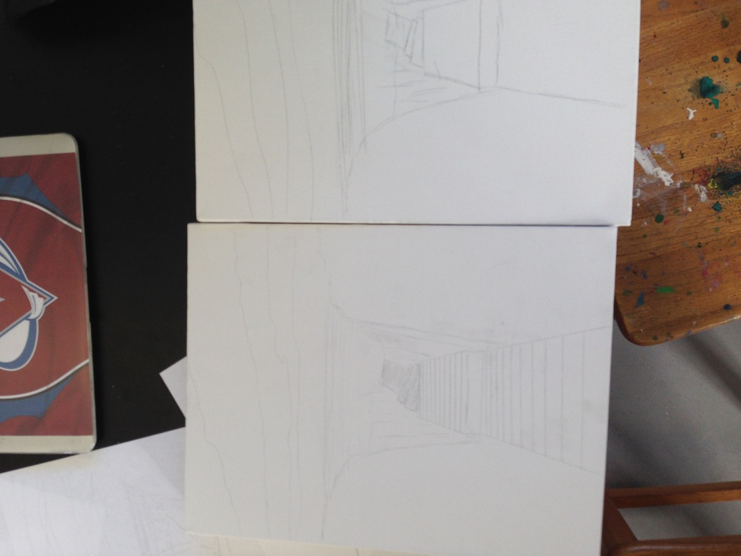
For a long time, I was undecided on what I should paint for my abstract project. I eventually decided to abstract an image of a boardwalk that I had taken this summer at the beach. These are the original sketches of the first two abstractions that i painted. The first painting, the most realistic one, features a narrow boardwalk winding between two large hedges, overlooking the ocean beyond. I think that this was a good idea for me because it was just the right size project- not too easy, nor too
| AuthorWrite something about yourself. No need to be fancy, just an overview. ArchivesDecember 2013 Categories |
 RSS Feed