Art Critique
Griffin Marshall
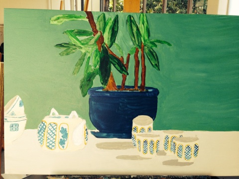
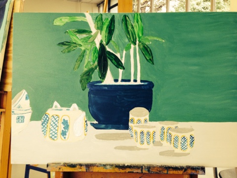
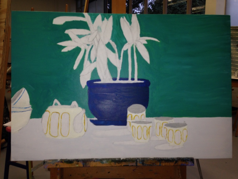
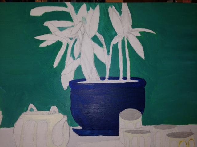
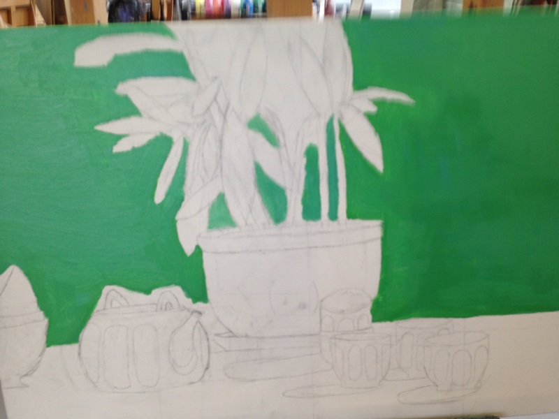
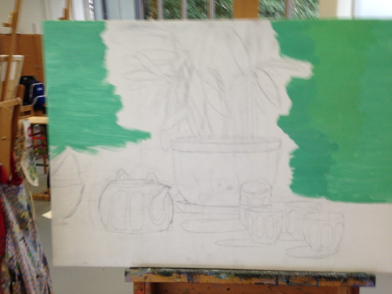
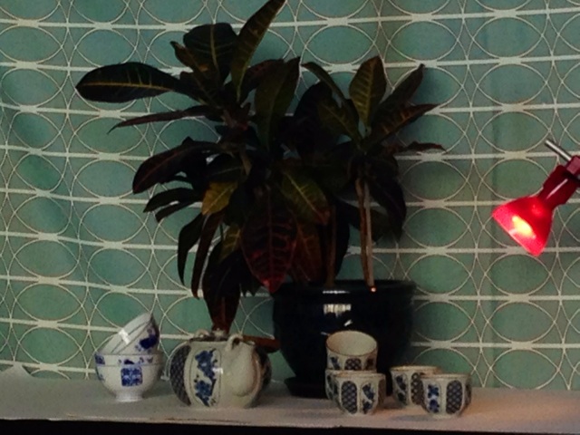
For this project, I painted a still life. It consisted of four bowls of china, three larger bowls, and a potted plant. This project was difficult for me; the hardest part of which was drawing the set. Drawing was very difficult, as every piece of the set had to be in a perfect position or else the painting would be messed up. After several instances of trial and error, I was finally able to draw the set correctly and accurately. The first thing I painted was the backdrop. It featured a teal cloth with white oval shapes on it. After that was finished, I painted the white tablecloth that the china was positioned on. Following the tablecloth, I started to paint the bowls a creamy white color that differed from the color of the tablecloth, but wasn’t too different or contrasting. Next came the pot that the plant was in; a solid navy blue color. The designs on the china were one of the hardest components of the entire piece. They were so meticulously painted onto the china, so they were so hard to recreate on canvas. The plant, which ended up to be the final aspect of the painting, were the hardest to paint, because recreating a plant on canvas and making it look realistic and three dimensional is no easy task. I think I did a decent job of it, though. I am decently satisfied with this project because I turned a difficult painting into a nice looking piece. I think that it could be neater, though, and it could be a little more realistic. In conclusion, I think that I did a suitable job in painting this piece.
Griffin Marshall
For this project, I painted a still life. It consisted of four bowls of china, three larger bowls, and a potted plant. This project was difficult for me; the hardest part of which was drawing the set. Drawing was very difficult, as every piece of the set had to be in a perfect position or else the painting would be messed up. After several instances of trial and error, I was finally able to draw the set correctly and accurately. The first thing I painted was the backdrop. It featured a teal cloth with white oval shapes on it. After that was finished, I painted the white tablecloth that the china was positioned on. Following the tablecloth, I started to paint the bowls a creamy white color that differed from the color of the tablecloth, but wasn’t too different or contrasting. Next came the pot that the plant was in; a solid navy blue color. The designs on the china were one of the hardest components of the entire piece. They were so meticulously painted onto the china, so they were so hard to recreate on canvas. The plant, which ended up to be the final aspect of the painting, were the hardest to paint, because recreating a plant on canvas and making it look realistic and three dimensional is no easy task. I think I did a decent job of it, though. I am decently satisfied with this project because I turned a difficult painting into a nice looking piece. I think that it could be neater, though, and it could be a little more realistic. In conclusion, I think that I did a suitable job in painting this piece.
 RSS Feed